Product Design · Vibe Coding
Live prototype ↗People budget money carefully but rarely see where their time goes. I designed a lightweight tracker that makes the shape of a week visible enough to reflect on.
My role
Builder: concept, four life pillars, and "spec first" approach
Timeline
Personal April 2026
Platform
Mobile web
The concept
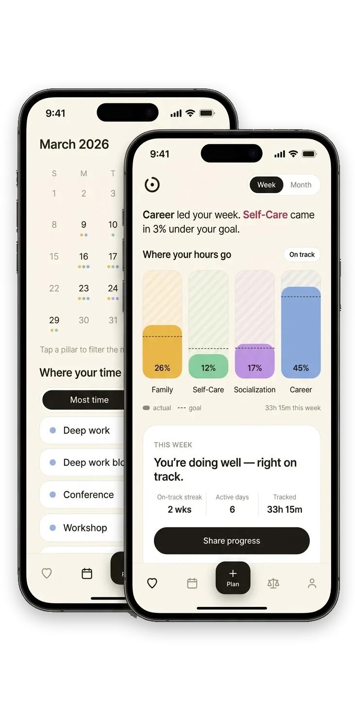
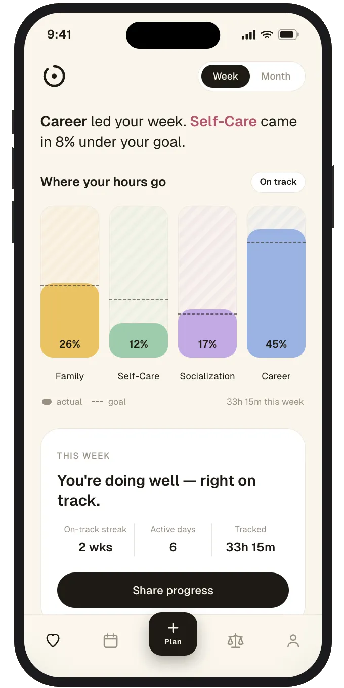
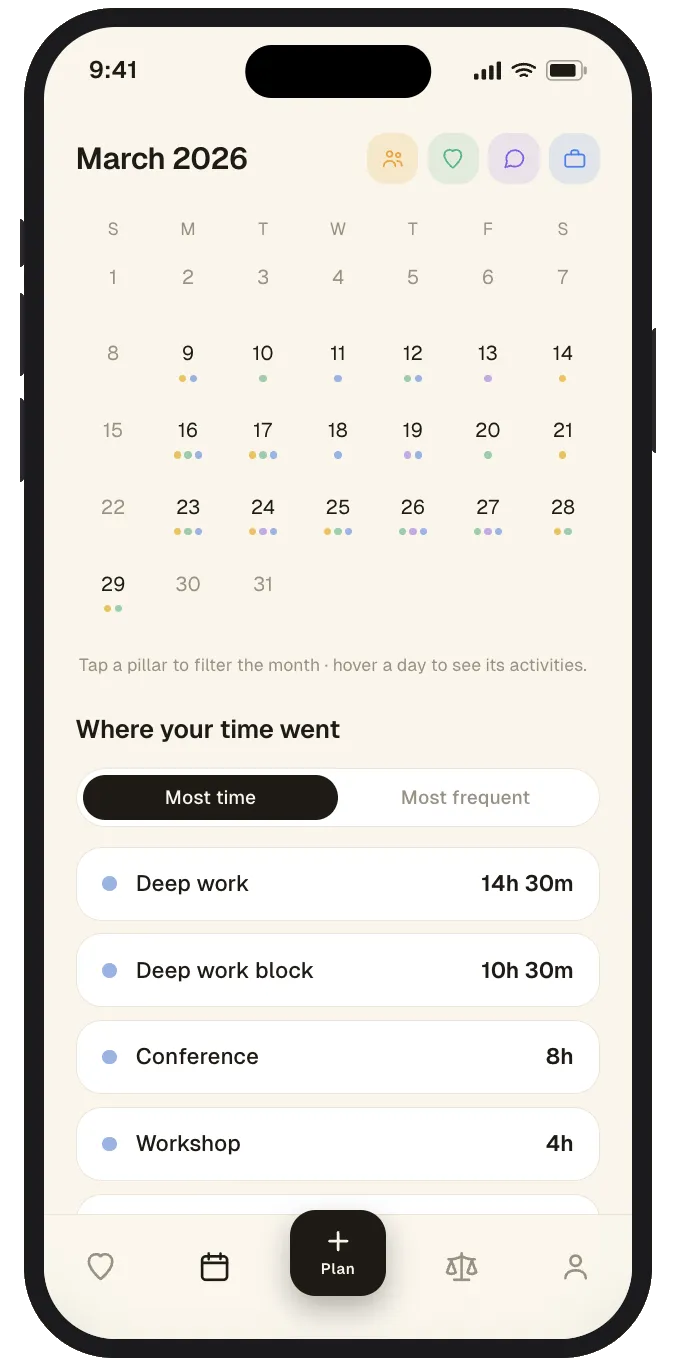
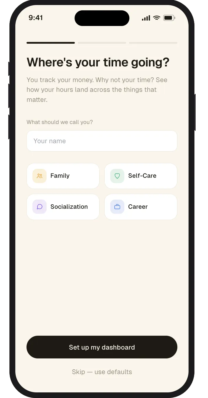
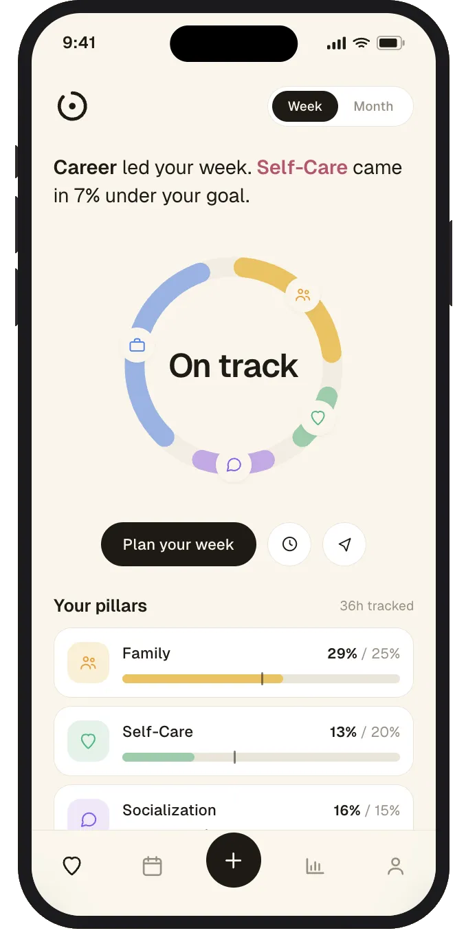
Budget your time the way you budget money
A budget app breaks your spending into categories so you can see where the money goes. Time Tracker does the same thing with your calendar. Four life pillars (Family, Self-Care, Socialization, and Career) are the default categories, each assigned a target share of your time. The app shows you the actual breakdown next to the one you choose for yourself.
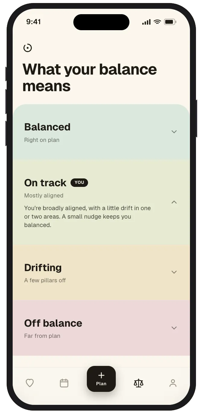
Each pillar carries its own target, so the dashboard always has something to measure against. My goal was to create something that could hold you accountable to how you want to spend your time, because most people, including me, feel like life runs on autopilot without us directing it. And almost always, people's regrets have to do with, “I wish I did that with my time at that age.” So I wanted to see where the time was actually going, in more than one view.
The decision
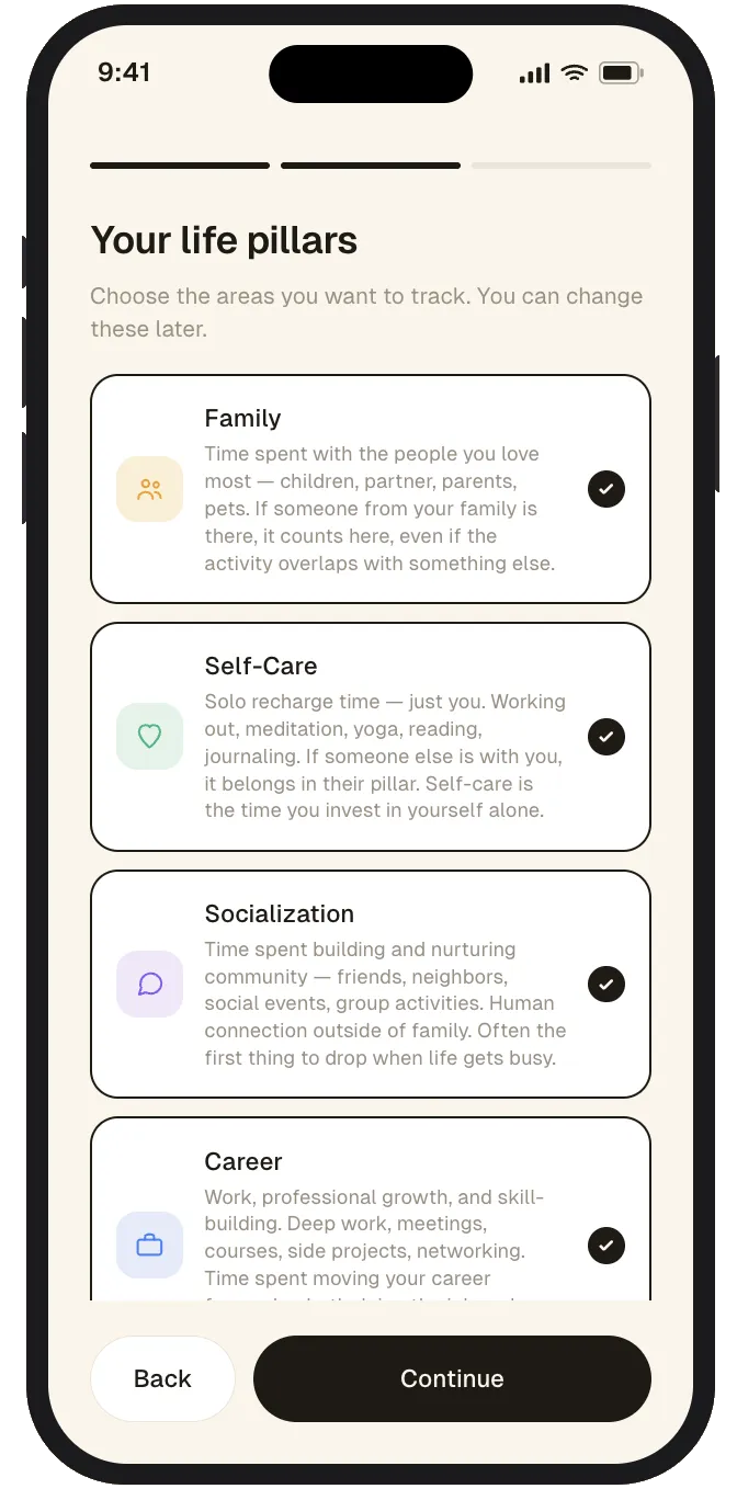
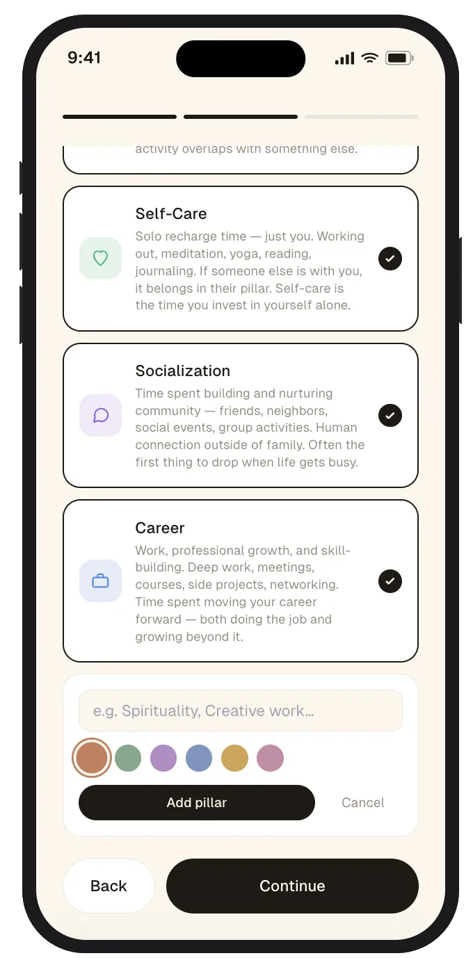
Pillars have to fit the life you're living
The hardest part of any tracker isn't the chart: it's categorization. Pillars have to be personal, because different things matter to different people at different stages in their life.
Since some categories could overlap, we also needed to set definitions around each category. So the onboarding starts with defaults, but lets people shape the system around what they actually want to track. The point is not to force one universal definition of a balanced life; it is to make the categories meaningful enough that the breakdown feels honest.
“Different things matter at different stages of life, so the pillars need to be personal enough to grow with you.”
Evolution
The donut was the first cut, not the final one
I was the person I was building for. I get stumped when someone asks where my time is going, and I knew I'd reach for this constantly, so the UX decisions came fast and felt aligned to what I needed. A lot of the vibe coding got refined in the same pass, tightening the build as the design got sharper.
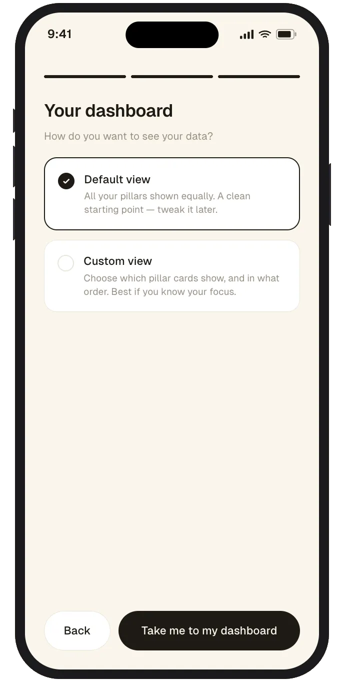
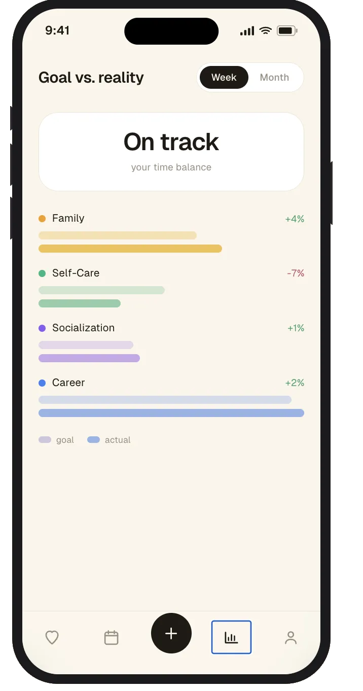
My first version was built on web with a donut chart, but the two didn't align well with the abstract outcomes I was trying to ground. A donut can tell you what happened, but it makes you decode whether the week reflected the life you were trying to live. I didn't want a pretty summary; I wanted a moment of accountability. The question was not just where did my time go? It was did my time go where I said it mattered? That is why the second version moved to goal-versus-actual bars and plain-language feedback: make the gap between intention and reality obvious without making you do math. It became the version I actually use.
What I learned
It's fun to see my ideas come to life
Bloom showed me I could move at the speed of my own judgment. Time Tracker showed me that judgment travels further when I write it down before I build, which is the difference between exploring an idea and shipping a coherent one.
That builder energy loops back to where I started: designing systems that make invisible needs easier to navigate.