Manager, Experience Design · Capital One
Discover banking customers needed to move to Capital One without feeling disrupted. I designed onboarding flows that simplified an overly complex migration strategy.
My role
Design & Strategy Lead
Timeline
Capital One · Jan 2026 – Present
Platform
Native (iOS, Android), Web, Mobile Web
Targets
The insight
We treated every customer as a “spender”
After reviewing our customer segments by product type and demographics, we framed every incoming customer through two behavioral lenses: savers and spenders. Since that was the relationship they already understood, and the one they would be bringing to Capital One, it was the one we had to build from. For the first wave of customers, we focused on spenders and triangulated behavioral transaction data (how Discover customers actually used their cards) with customer research before we built on it.
It sounds small, but the framing did real work. It gave a cross-functional team one shared mental model of who we were designing for, and it set the job-to-be-done: meet people where they are, spending, and create a clear, low-friction path toward the rest of what a bank can do for them.
“They're not new customers. They're spenders we already have, and the design job is to show them what else is here.”


The experience · 01
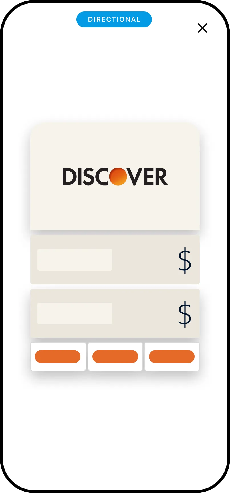
The First Time Experience
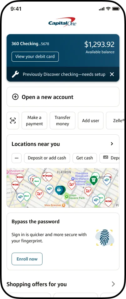
The Capital One app already had established L1 and L2 experiences through EASE, and we couldn't alter those surfaces much. So we focused on the First Time Experience: the first thing a Discover customer would see, a welcome animation followed by a single screen that lays out everything changing for them, at a glance. It orients before it asks for anything: you're in the right place, here's what just happened, here's what's yours.
The animation does the emotional work, marking the moment as a welcome rather than a disruption. The glance screen does the cognitive work, answering “what changed?” in one place. To preserve that continuity into the landing page, we reused familiar language and a wrench icon in the mudflap, clearly signaling which accounts still needed setup to keep customers' existing routines intact.

The experience · 02
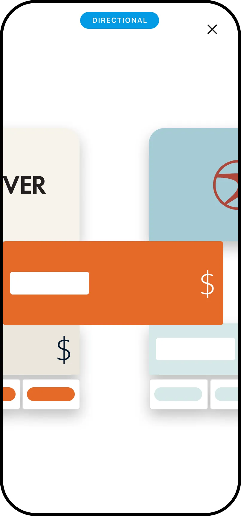
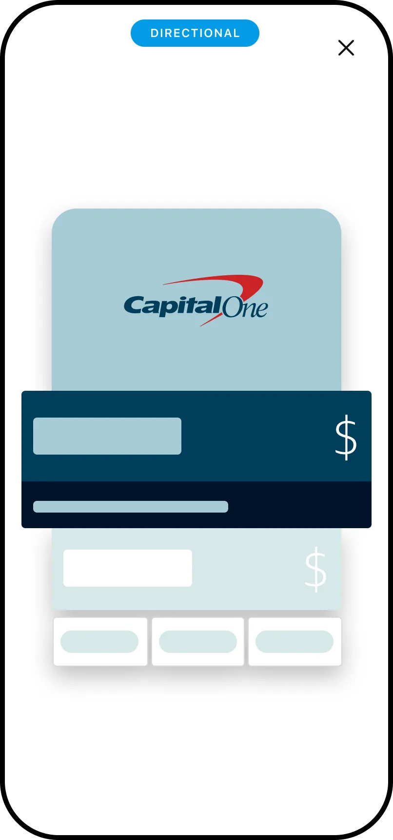
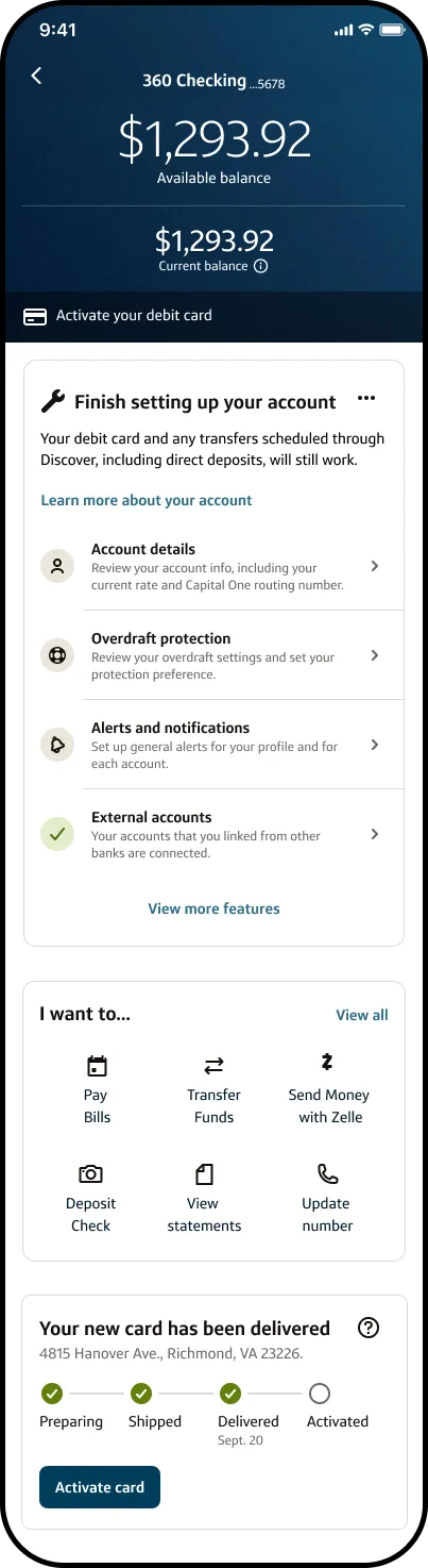
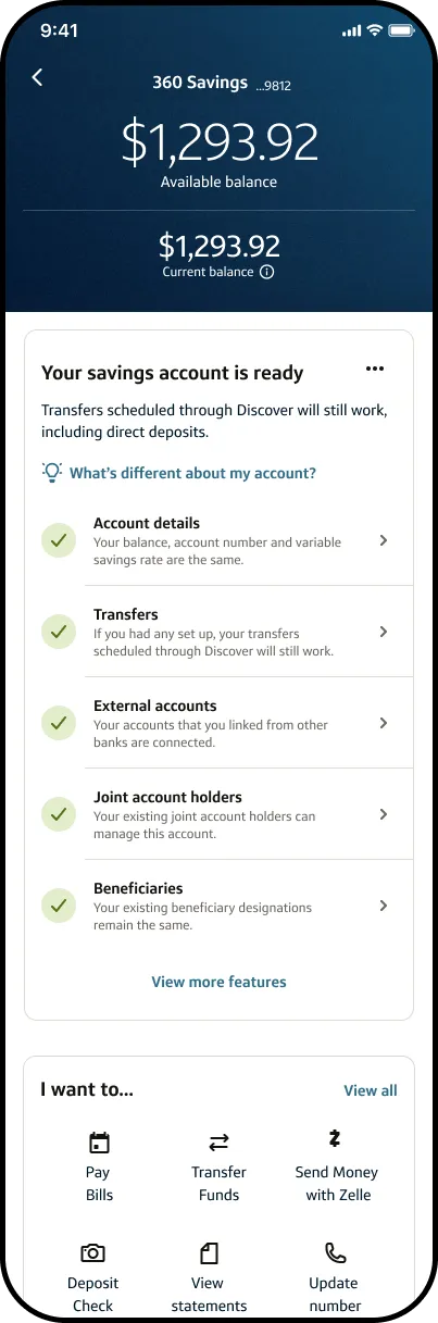
L2: setup and wayfinding
The second layer (L2) is where intent turns into action: a checklist of the things that actually make Capital One someone's primary bank: setting up direct deposit, moving autopay and recurring payments, and activating the new card. Each completed step is both a setup task and a small proof that the switch was worth making.
These aren't arbitrary tasks. Direct deposit and recurring payments are the stickiest behaviors a bank can earn, so we sequenced the checklist around the actions with the greatest retention payoff. “What's different about my account?” gave customers the account-level details that were too specific for FTUX, while the recurring wrench icon acted as wayfinding, showing exactly where setup was still required.
The wrench icon and supporting content took most of our deliberate design decisioning. That pairing was what convinced senior stakeholders that customers would have enough confidence to understand what needed fixing, complete the right setup steps, and move through the transition smoothly. It also became a call-deflection strategy: every screen that explained itself prevented an avoidable call to a front-line associate.

The hard part
Designing inside the lines, and selling the why
The biggest constraint wasn't the brief, it was the canvas. This lives inside the full Capital One app, which doesn't allow for many custom components, so the wayfinding system had to be built almost entirely from the existing toolkit, restructured and recomposed to do a new job. The creativity was in working within the system, not around it.
Layered on top: compliance requirements shaped the language, a hard brand-migration cutover meant narrow windows, and there's no second chance: you can't re-onboard someone, so the first impression had to land the first time.
And the hardest constraint wasn't on the screen at all: getting a layer of pure clarity prioritized meant making the case for it to senior leadership.
Outcome
Measured on retention
Success will be measured on two things: the customer volume retained through the switch and how few calls the change drives to front-line associates. The experience is scheduled to launch and enter testing in late 2026, so results are still to come. I'll update this case study as retention and call-volume data become available.
Those enterprise constraints made me hungry to build faster, smaller, and closer to the idea itself.